Industry
Education
Client
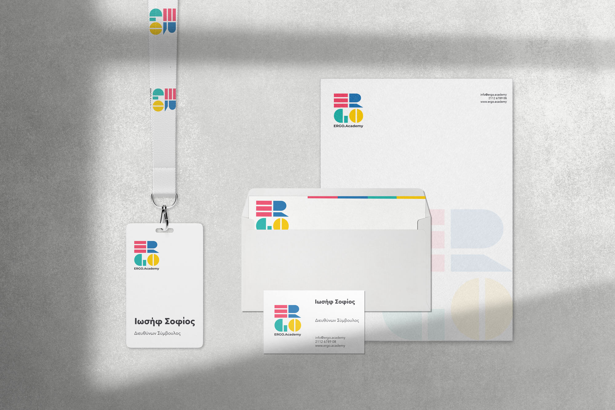
ERGO Academy
ERGO Academy, Brand Identity

Exploring how colour and geometry can translate learning into a clear, contemporary visual language.
Designed for ERGO Academy, this logo explores how geometry and colour can communicate learning in a clear, contemporary way. The identity is constructed from simple geometric forms and a four-colour palette, magenta, blue, mint and yellow, creating a system that feels structured yet open, precise yet expressive. The combination of bright colour and controlled form allows the logo to remain confident and distinctive, while avoiding visual noise. The result is a mark that reflects education as a process of building, connecting and evolving.